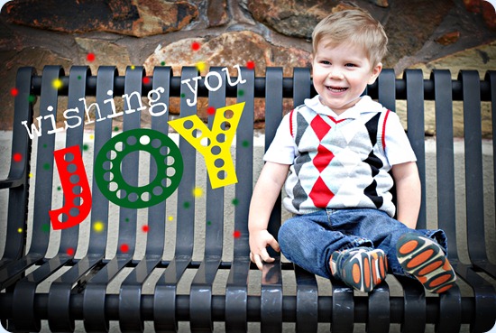
As I mentioned in my last post, I wanted to design my own card this year. I looked online for ideas (because let’s face it, I’m not that creative) and played around with a few ideas. I wanted to do a double-sided card, but I had some questions about how to create it and kept meaning to go by a local print shop in town to ask them how I should do it… but time just got away from me and I ended up going with a one-sided card. I had Britney take our family pictures (like the one in the post just before this one) but between my son not looking at the camera and my husband not looking at the camera (SIGH) I didn’t really have one picture of all three of us one that was Christmas-card worthy. I ended up going with this shot of Christopher that I took before Britney took our family pictures.
I did some basic editing to the picture in Photoshop and added the words “wish you joy” and I ended up with this:
My original intention was for this to be the “front” of our card and then to do a “back” with a picture of all three of us, but like I said – I never got around to it. I had almost decided not to do cards at all this year… but the thought of not having one just made me sad. So one Saturday morning when I really needed to be working on homework and finals junk, I decided to just add our name and a bible verse. I always want a bible verse on our Christmas cards. And instead of taking them up to the professional print shop in town, I just used my dad’s nice laser printer.
So after playing around with a few different layouts, my final Christmas Card was this:
I wasn’t a hundred percent happy with my final product, but I think that it’s because I had originally envisioned so much more, you know? Stephen loves it. I like it.
I made a few rookie mistakes that I want to document for future reference.
- The green letters in our last name look okay on the computer, but they were a little dark printed. I should have used a lighter background.
- I over-edited the picture and it turned out a little grainy-looking when I printed it. Next time, run less actions on the picture and print it off before adding any words or graphics.
- Use thicker paper. I used cardstock but it was still not as sturdy/thick as I would have liked. Next time I will probably use a print shop in town instead of printing them myself, so I will need to tell them to use a thick cardstock.
- Make sure that I use pre-cut paper. I printed these 2 to a page and then had to cut them out using a scrapbook paper-cutter. It was an hour of my life that I’ll never get back. Also, I got the text really close the bottom of the card and it was a pain because if I got the paper cutter just a faction of an inch too close to the card, it cut off the bottom of my text. Pain. In. My. Rear.
- Next time, start designing cards in September/October and have them ready to go to the print shop in November. Last-minute printing and addressing makes things so much more stressful than they need to be. :)


No comments:
Post a Comment
I always love to hear from my readers! Feel free to leave a comment!
--Steph